Brand identities and supplemental graphics created for CLCE programs at Rochester Institute of Technology
Logo
Horizons is a deliberative dialogue program that helps students look at current social issues objectively and learn about differing opinions on such topics and how to effectively discuss them.
Facebook Banner
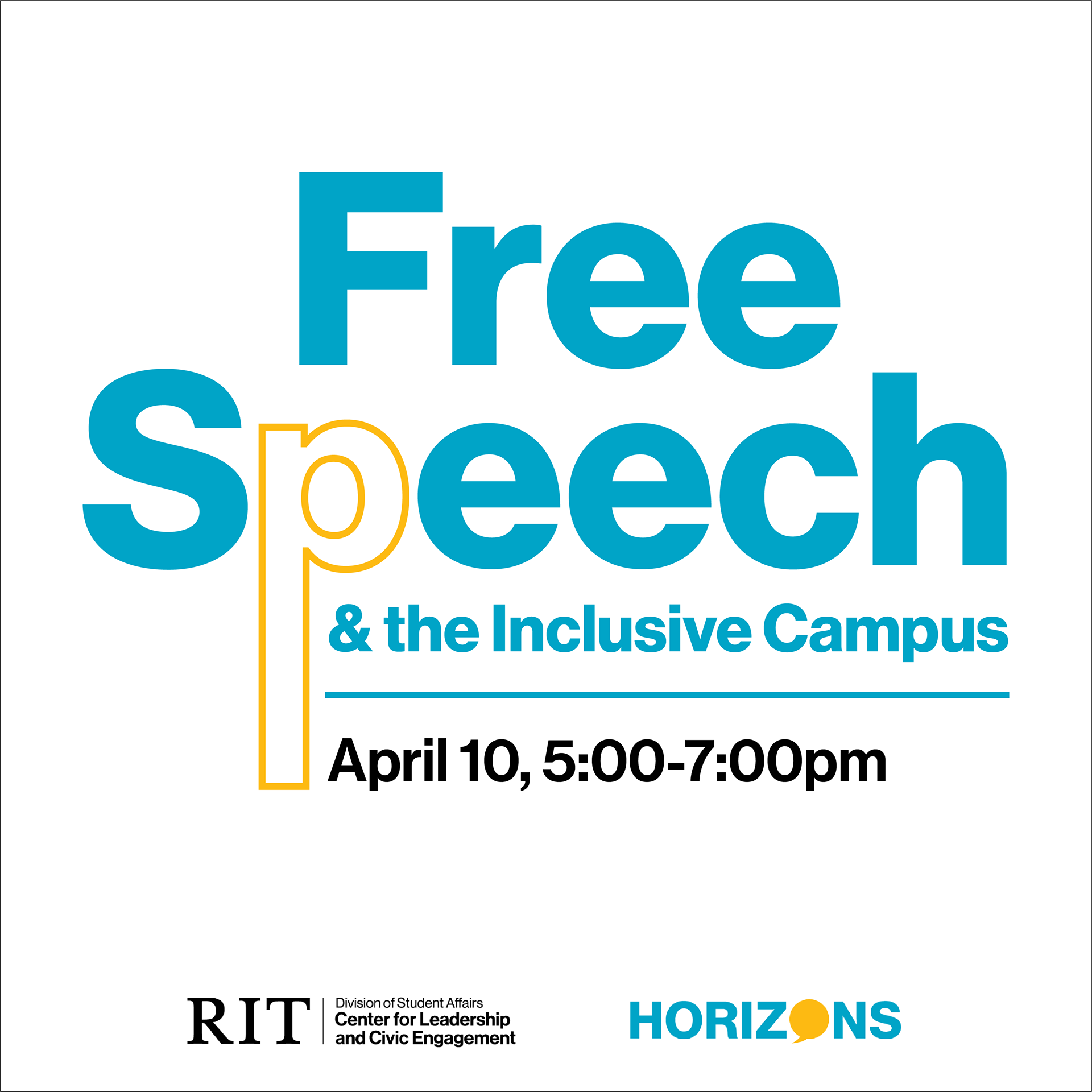
Companion Instagram Post
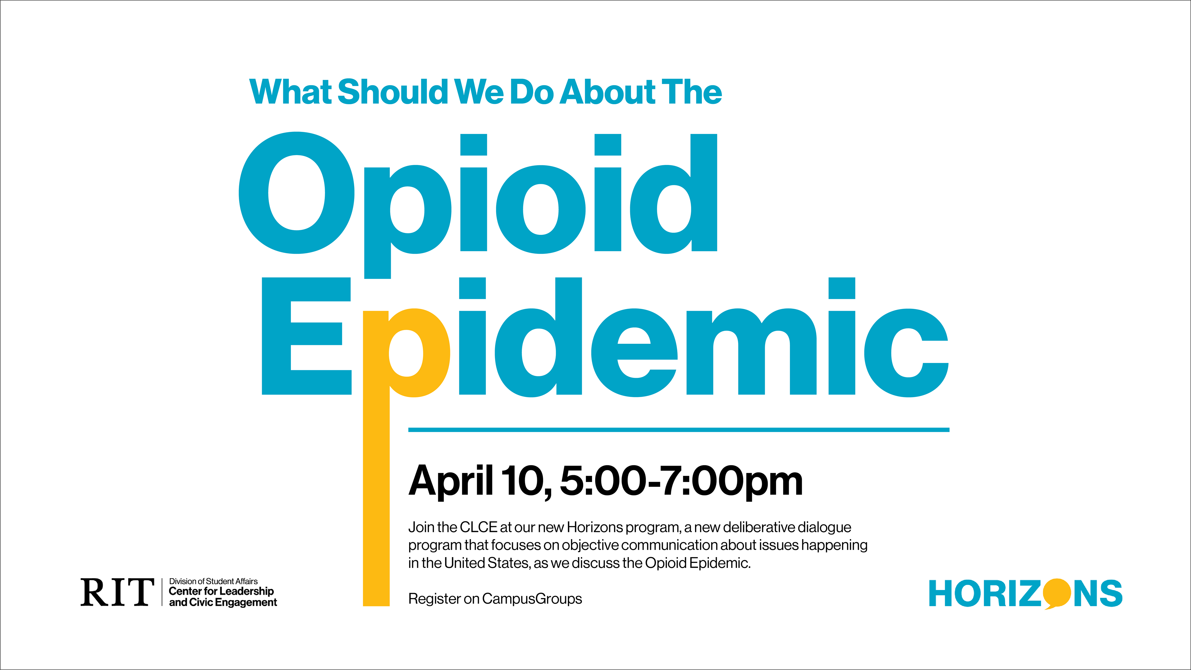
Facebook Banner
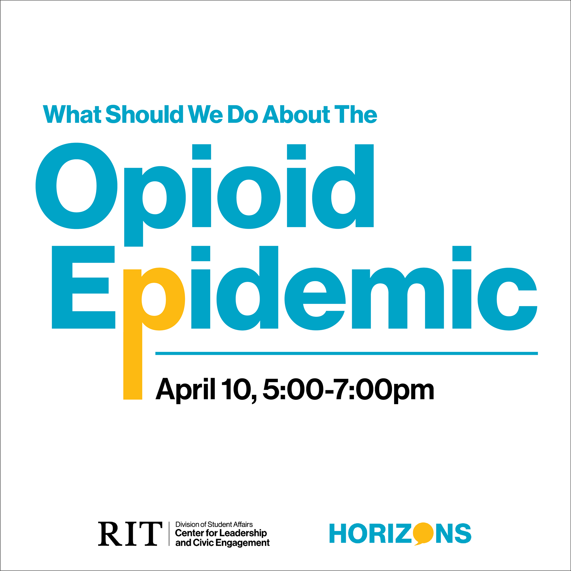
Companion Instagram Post
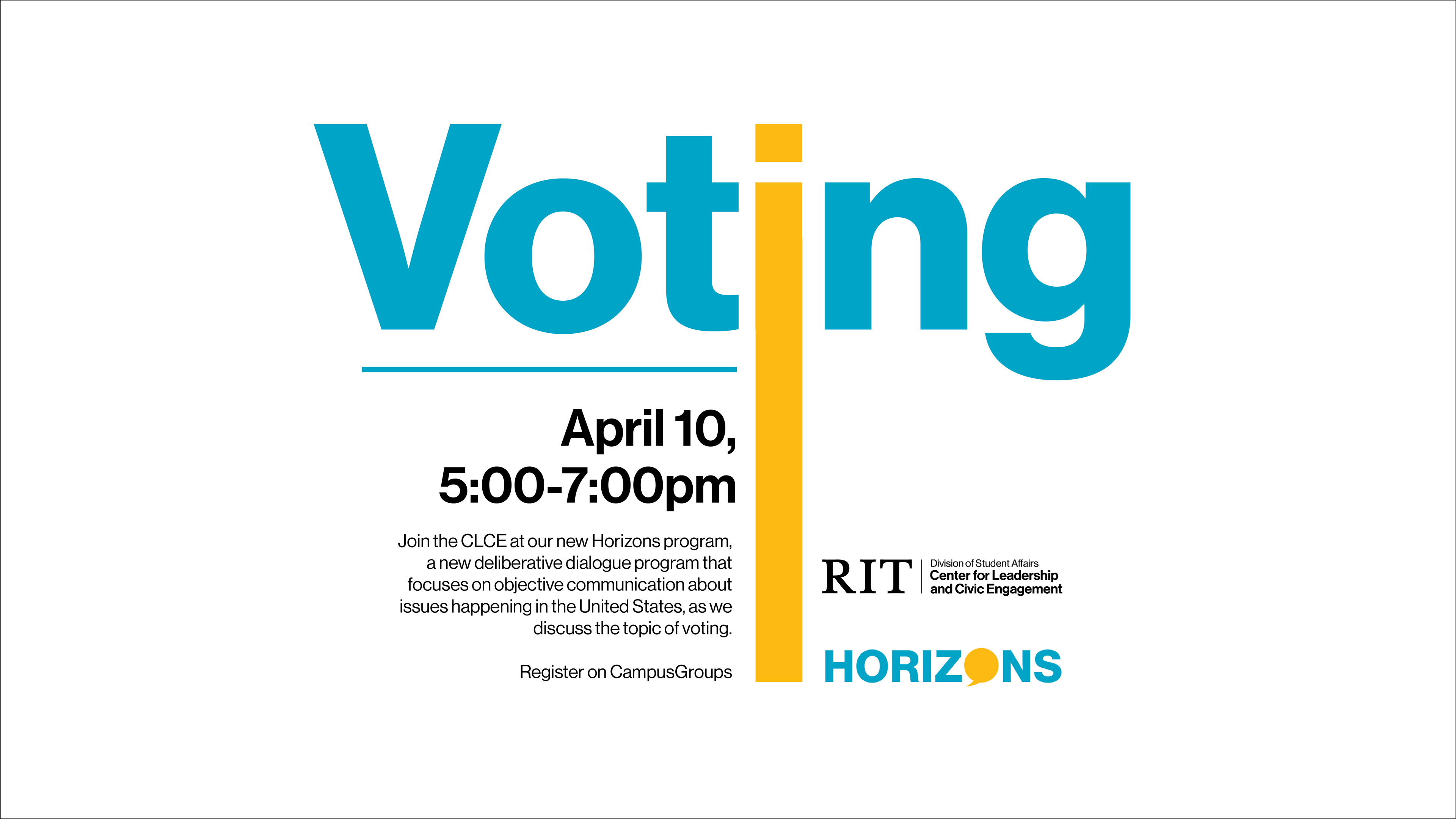
Facebook Banner
Companion Instagram Post
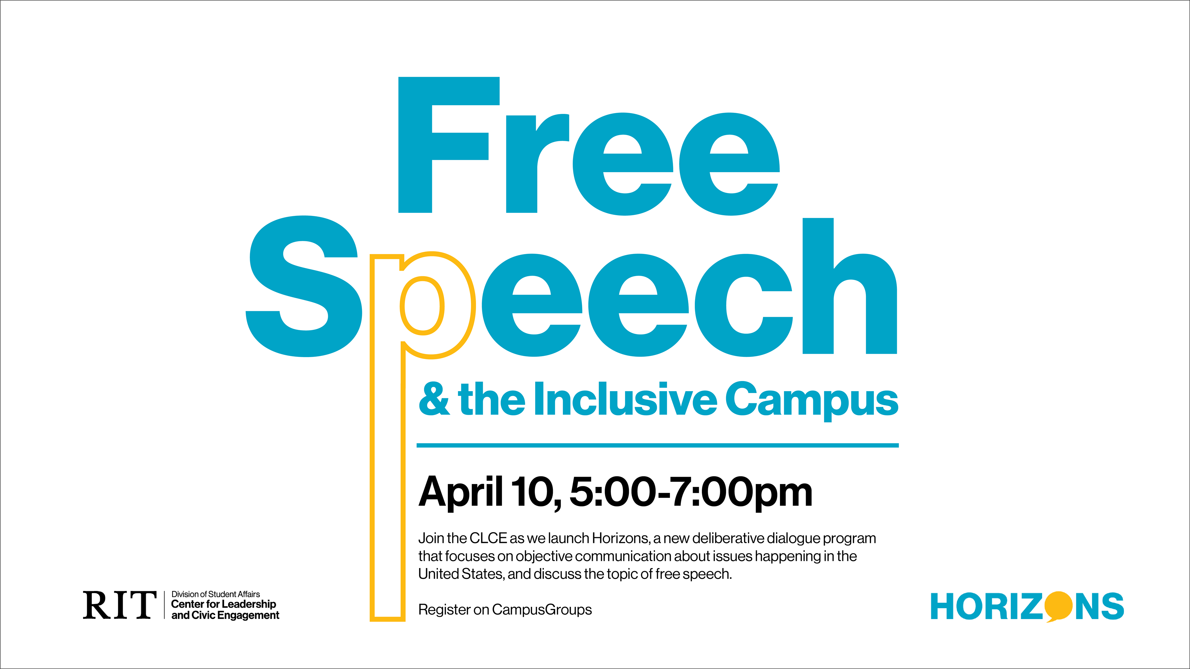
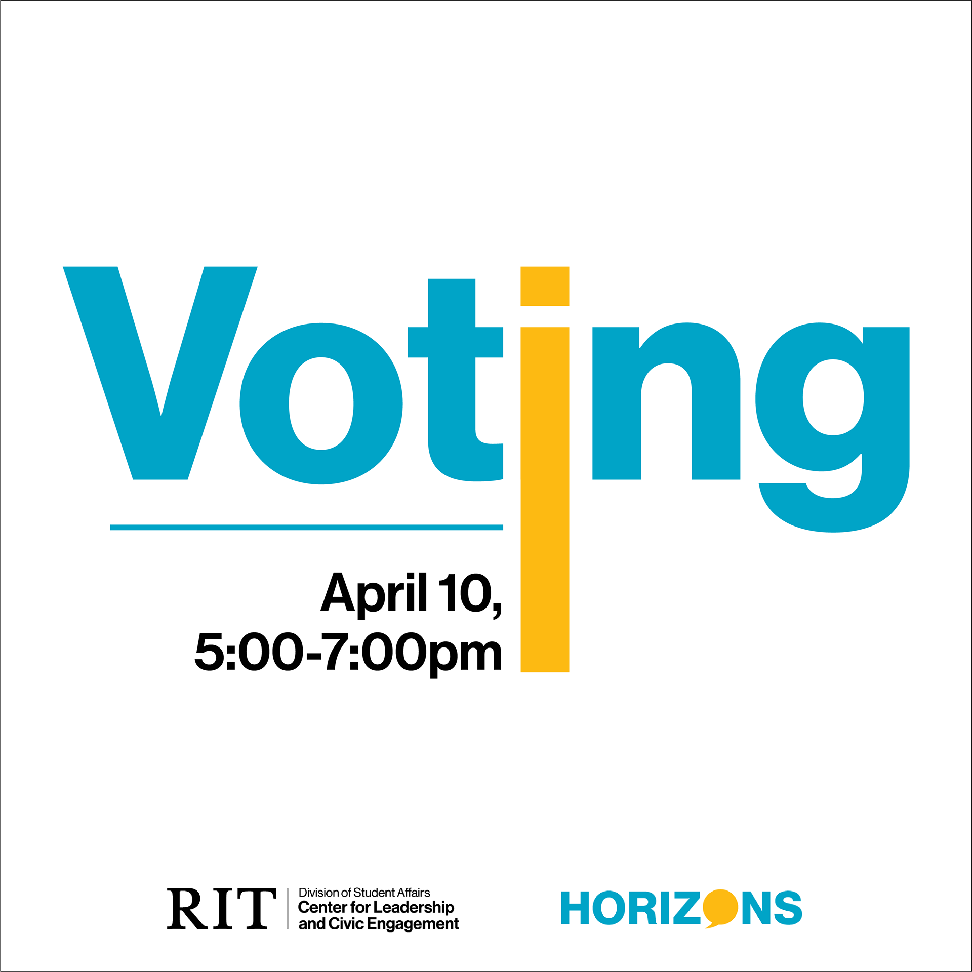
When designing the branding for the program, a few things had to be kept in mind: the university's branding, staying unbiased & objective, and the vast number of topics. By keeping the designs strictly text-based, the program keeps the focus on the topic at hand and remains unbiased towards an opinion. Using the university's typefaces and colors keeps the designs on brand and also helps to keep the designs from showing any bias.
The extended letter acts as a representation of expanding one's knowledge when they participate in the program and creates a constant theme that ties all the graphics together.
Logotype
Leadership RITreat is a one-day event that helps students learn about their leadership style and develop their leadership skills.
Facebook Banner, Original Style
The original style direction for the program was outdoorsy and summer campy, since the program took place at a campground. The imagery shows a literal depiction of the event.
Facebook Banner, New Style
However, with the program looking to expand, a literal depiction wasn't really going to work anymore. The redesign needed to emulate the excitement and adventure of the program without being so literal. So the new direction took inspiration from comic books.
Logotype
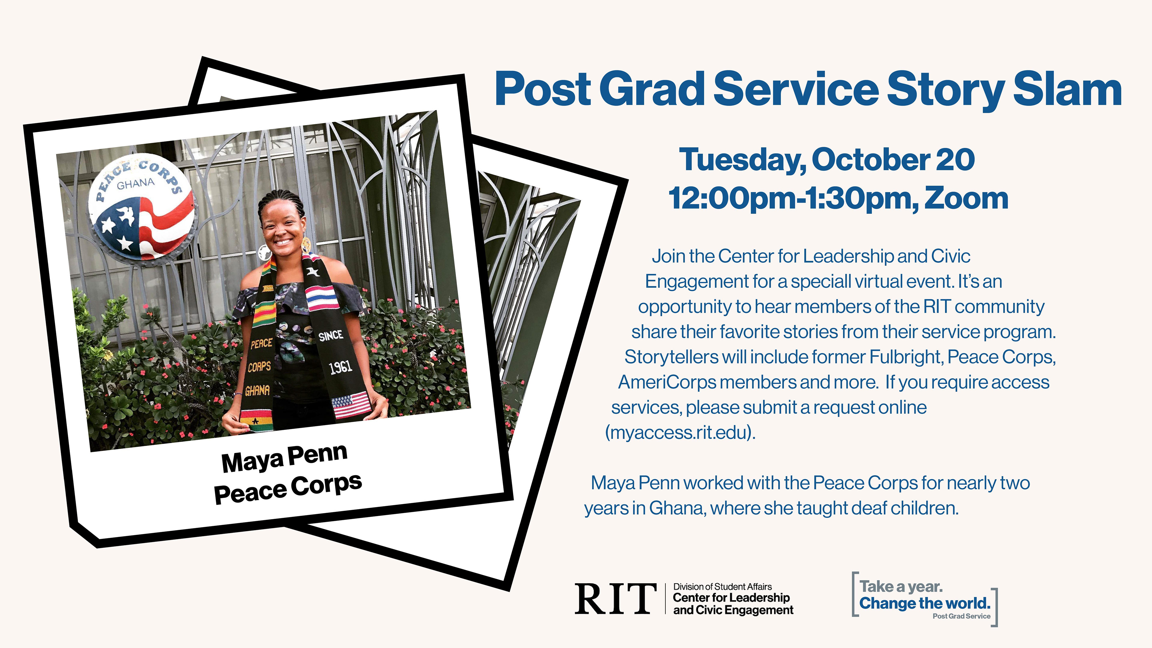
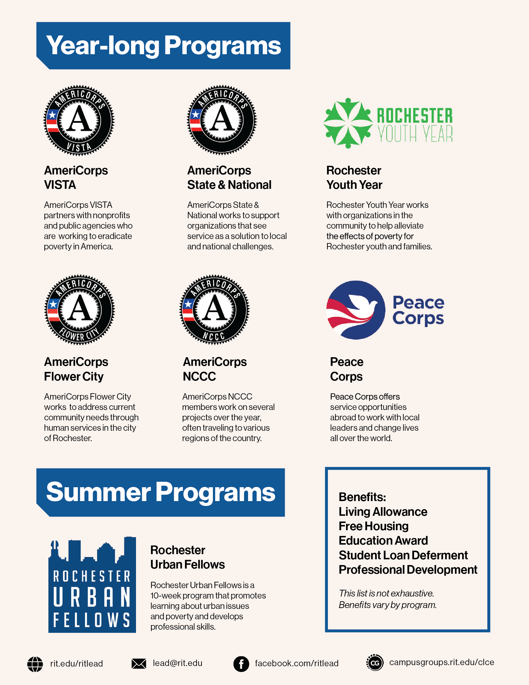
Post Grad Service connects students to paid, full-time service opportunities after graduation. The colors illustrate the professionalism of the program, while the structure shows a playfulness, merging fun and serious into one.

Info Card Front
Info Card Back

Facebook Banner, Overall Event
